An attempt to return the purpose and narrative to an important and beautifully-presented data-driven message, using solely R and ggplot.
Effective conveyance of a meaningful message through data visualisation first requires capturing a viewer’s limited attention. Design is a very important part of modern data visualisation, especially when trying to capture the attention of an audience who may not have a scientific understanding of data.
The following chart is incredible beautiful in design. It appears at first to convey a strong and meaningful message. It would look great on a page. It has purpose. However, in the designer’s attempt to design a visual masterpiece, have they lost the true meaning of their work, and failed to effectively convey their message?

It is indeed a beautiful work, but have the following considerations lead to a loss of meaning in their work?
- A Sankey diagram is not intended to be used to convey volumetric data, but rather to illustrate an activity flow. At first, this may seem a novel use of this chart type, but has it lead to further issues?
- Has the two-dimensional use of both height/width and length of the bar chart representing the “share of plastic inadequately managed” lost meaning, as the mind’s eye interprets only the length in absence of the bar width (a flow-on effect of the combined use with a Sankey diagram)?
- Has the normalised length of the bars lead to a perception that they are all equal, losing perspective of the true volume of waste produced and mismanaged?
- Has the use of a one-dimensional bubble plot to represent GDP lost precision and meaning as bubbles become difficult to interpret and exaggerated through bunching in an almost logarithmic pattern?
- Was there value in presenting so much data that it becomes difficult to read even the labels of the data categories, and the representation of data values so small that determining precision is impossible?
It is indeed a valiant and a visually beautiful attempt at conveying an important message, but something the focus on novel presentation can lead to a loss of the narrative and value of the designer’s work.
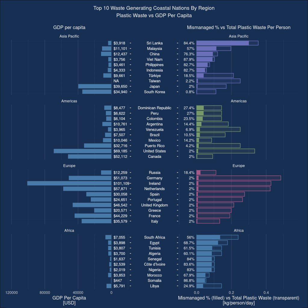
While far from as visually-appealing, could we re-arrange this data in a way that is easier to interpret, both by improving perceivable precision, and making it easier to correlate multivariate data? I have attempted to do so below, using only R and ggplot to create this data visualisation (without attempt at this stage to match the design beauty of its predecessor).
References
Alderson, B. (2023, August 23). Catherina van der Linden, believed to be Australia’s oldest living person at 111, credits longevity to regular gym sessions. ABC News. Retrieved September 15, 2023, from https://www.abc.net.au/news/2023- 08-23/catherina-van-der-linden-prepares-for-111th-birthday/102764722 (https://www.abc.net.au/news/2023-08- 23/catherina-van-der-linden-prepares-for-111th-birthday/102764722)
Ammendolia, J., Saturno, J., Brooks, A. L., Jacobs, S., & Jambeck, J. (2021). An emerging source of plastic pollution: Environmental presence of plastic personal protective equipment (PPE) debris related to COVID-19 in a metropolitan city. National Library of Medicine, 269, 116160. https://doi.org/10.1016/j.envpol.2020.116160 (https://doi.org/10.1016/j.envpol.2020.116160)
Evergreen, S., & Emery, A. K. (2016, May). Data Visualization Checklist. Retrieved September 10, 2023, from http://stephanieevergreen.com/wp-content/uploads/2016/10/DataVizChecklist_May2016.pdf (http://stephanieevergreen.com/wp-content/uploads/2016/10/DataVizChecklist_May2016.pdf)
Evergreen, S., Sanjines, S. P., Emery, A. K., & Lyons, J. R. (n.d.). Data Visualization Checklist: Where are you strong? Where can you grow? Evergreen Data. Retrieved September 10, 2023, from https://stephanieevergreen.com/data-visualization- checklist/ (https://stephanieevergreen.com/data-visualization-checklist/)
Glivinska, A. (2023, May 11). The 30 Best Data Visualizations of 2023 [Examples]. Visme Blog. Retrieved September 5, 2023, from https://visme.co/blog/best-data-visualizations/ (https://visme.co/blog/best-data-visualizations/)
Holtz, Y. (n.d.). Sankey Plot. The R Graph Gallery. Retrieved September 10, 2023, from https://r-graph-gallery.com/sankey- diagram.html (https://r-graph-gallery.com/sankey-diagram.html)
ITU. (n.d.). Economy classifications. Retrieved September 11, 2023, from https://www.itu.int/en/ITU- D/Statistics/Pages/definitions/regions.aspx (https://www.itu.int/en/ITU-D/Statistics/Pages/definitions/regions.aspx) Jambeck, J., Geyer, R., Wilcox, C., Siegler, T. R., Perryman, M. E., Andrady, A. L., Narayan, R., & Law, K. L. (2015a).
Plastic waste inputs from land into the ocean. Science, 347(6223), 768–771. https://doi.org/10.1126/science.1260352 (https://doi.org/10.1126/science.1260352)
Jambeck, J., Geyer, R., Wilcox, C., Siegler, T. R., Perryman, M. E., Andrady, A. L., Narayan, R., & Law, K. L. (2015b).
Plastic waste inputs from land into the ocean [Dataset; Excel XLSX]. In Science. American Association for the
Advancement of Science. https://www.science.org/doi/suppl/10.1126/science.1260352/suppl_file/1260352_supportingfile_suppl._excel_seq1_v1.xlsx (https://www.science.org/doi/suppl/10.1126/science.1260352/suppl_file/1260352_supportingfile_suppl._excel_seq1_v1.xlsx)
Jambeck, J., Law, K., & Geyer, R. (2015). Plastic waste inputs from land into the ocean. Jambeck Research Group.
Retrieved September 10, 2023, from https://jambeck.engr.uga.edu/landplasticinput (https://jambeck.engr.uga.edu/landplasticinput)
Kettle, J. (2020, October 30). Who Is Bottling Plastic Waste Pollution. Behance. Retrieved September 5, 2023, from https://www.behance.net/gallery/106936329/Plastic-Waste-Pollution-data-visualisation (https://www.behance.net/gallery/106936329/Plastic-Waste-Pollution-data-visualisation)
Kilin, I. (2021, September 20). A deep dive into. . . bubble charts. Datylon. Retrieved September 10, 2023, from https://www.datylon.com/blog/bubble-chart-deep-dive (https://www.datylon.com/blog/bubble-chart-deep-dive)
Otto, E., Culakova, E., Meng, S., Zhang, Z., Xu, H., Mohile, S. G., & Flannery, M. (2022). Overview of Sankey flow
diagrams: Focusing on symptom trajectories in older adults with advanced cancer. Journal of Geriatric Oncology, 13(5), 742–746. https://doi.org/10.1016/j.jgo.2021.12.017 (https://doi.org/10.1016/j.jgo.2021.12.017)
Pyramid plot in R. (2017, May 23). Stack Overflow. https://stackoverflow.com/questions/33832047/pyramid-plot-in-r (https://stackoverflow.com/questions/33832047/pyramid-plot-in-r)
United Nations Department of Economic and Social Affairs. (2022). Per Capita GDP in US Dollars: All countries for all
years – sorted alphabetically [Dataset; XLSX]. https://unstats.un.org/unsd/amaapi/api/file/9 (https://unstats.un.org/unsd/amaapi/api/file/9)
United Nations Department of Economic and Social Affairs Statistics. (n.d.). Standard country or area codes for statistical use (M49). UNSD. Retrieved September 11, 2023, from https://unstats.un.org/unsd/methodology/m49/ (https://unstats.un.org/unsd/methodology/m49/)
United Nations Statistics Division. (n.d.-a). Downloads. Retrieved September 19, 2023, from https://unstats.un.org/unsd/snaama/Downloads (https://unstats.un.org/unsd/snaama/Downloads)
United Nations Statistics Division. (n.d.-b). National Accounts – Analysis of Main Aggregates (AMA). Retrieved September
13, 2023, from https://unstats.un.org/unsd/snaama/ (https://unstats.un.org/unsd/snaama/)

Leave a comment